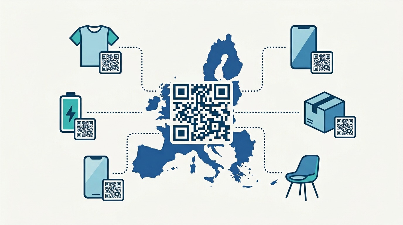
QR codes now reach 2.2 billion users globally, and 59% of consumers scan one every single day. But not all QR codes are created equal. Custom-designed QR codes generate 30–45% more scans than their plain black-and-white equivalents — a gap that represents real, measurable business impact. In a world where every brand touchpoint is evaluated on quality and credibility, a generic QR code signals the opposite of professionalism.
QR code design has evolved from a niche concern into a strategic capability. Whether your codes appear on product packaging, poster campaigns, or print brochures, the design directly influences visibility, trust, and scan behavior. This guide covers every dimension of QR code design — from the technical principles that ensure reliable scanning to the brand customization techniques used by professional marketing teams.
By the end, you will have a complete, practical framework for creating custom QR codes that function as durable branded assets and deliver consistent results across every channel.
A well-designed QR code must satisfy two requirements simultaneously: it must be technically scannable by any device, and it must visually reinforce the brand presenting it. These are not competing goals — understanding the underlying technology makes both achievable together.
A QR code stores information in a matrix of dark and light modules arranged in a square grid. Three core structural elements are non-negotiable: the finder patterns (the three square symbols in each corner that tell a scanner where the code begins and ends), the timing patterns (alternating modules that establish the grid coordinates), and the quiet zone (the blank margin surrounding the entire code). Altering or obscuring any of these breaks scannability instantly.
Within those constraints, the data modules in the center of the code offer significant creative latitude. The level of design flexibility available depends on the error correction level you select:
Choosing the wrong error correction level is one of the most common design errors. Always set Level H before adding any logo or overlay. With Level H, QR codes maintain a 98% successful scan rate even when up to 20% of the code is obscured.

The era of treating QR codes as functional afterthoughts is over. Research from Bitly and multiple scan behavior studies consistently show that branded QR codes generate 30–45% higher scan rates than generic black-and-white codes. The mechanism is straightforward: a code that visually aligns with your brand signals legitimacy, while an unbranded code triggers hesitation.
This matters particularly as quishing (QR code phishing) has become a recognized threat. Consumers have learned to be cautious about generic QR codes from unknown sources. A code featuring your logo and brand colors immediately communicates identity and builds the micro-trust required for a scan.
Beyond scan rates, custom QR code design delivers measurable downstream benefits:
The return on investment is substantial. Spending a few minutes customizing a QR code in Supercode can meaningfully increase the scan-to-conversion rate for an entire print run or campaign. Learn more about how design-led QR programs deliver ROI in our guide to QR code marketing strategy.

Effective QR code design follows clear, testable principles. Apply these standards consistently and your codes will scan reliably across every device and lighting condition.
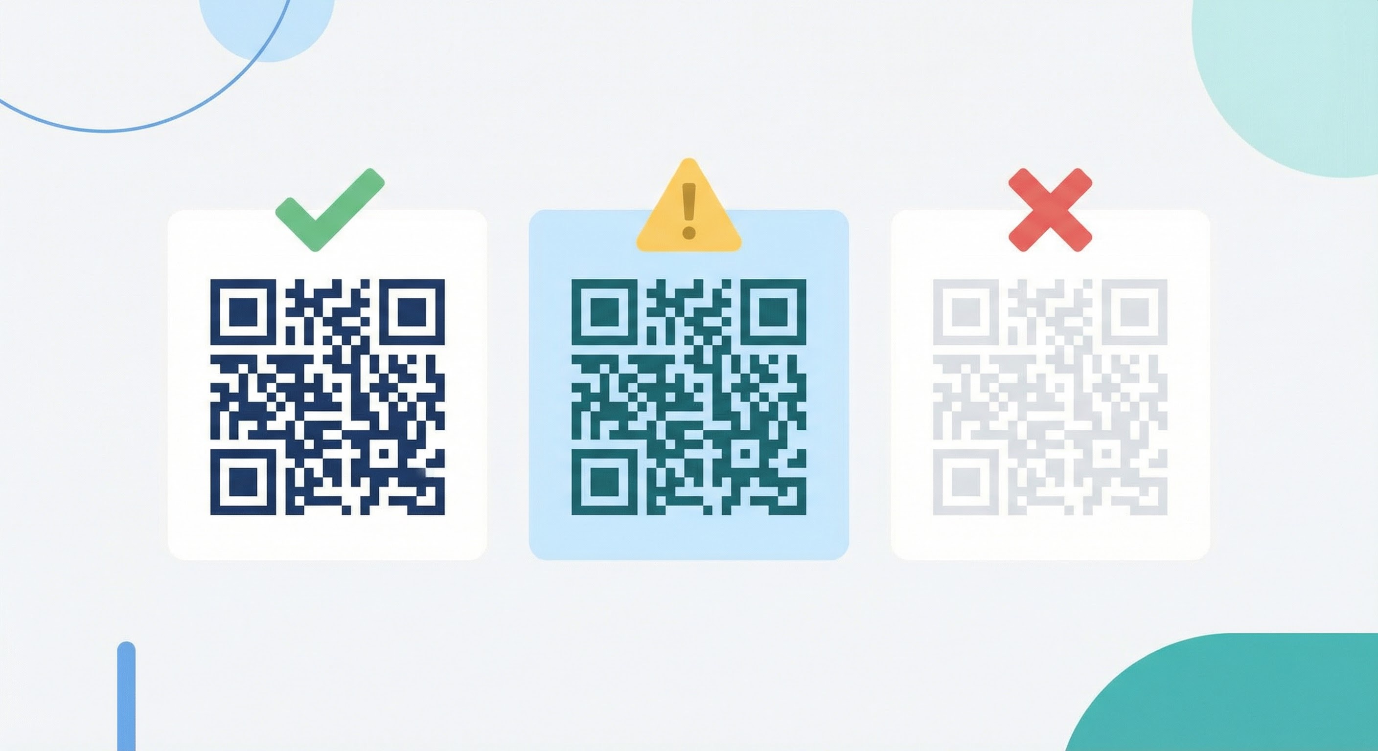
The single most important technical constraint in QR code design is contrast ratio. Scanning algorithms distinguish modules by detecting the difference between foreground (dark) and background (light). The minimum recommended contrast ratio is 4.5:1 — the same standard used for web accessibility. In practice, higher is better: a 7:1 ratio provides reliable scanning across low-light environments and aging device cameras.
Rules to follow:
The physical size of a QR code must match its scanning context. A useful formula from QR best practice guides: scanning distance ÷ 10 = minimum code size. For a code on a poster viewed from 1 metre away, the minimum is 10cm × 10cm. For a billboard at 10 metres, 100cm × 100cm.
Absolute minimum for any print use: 2cm × 2cm (0.8in × 0.8in). Below this, most smartphone cameras cannot resolve the module density reliably.
The quiet zone — the blank white margin surrounding the code — must be at least 4 modules wide on all sides. This zone tells the scanner where the code ends and the surrounding content begins. Crowding a QR code against adjacent text or imagery eliminates this margin and causes read failures. For more on size standards across print media, see our complete QR code printing guide.
Standard QR codes use square modules, but modern generators like Supercode allow module shapes to be customized — rounded corners, dots, diamonds, and more. These shape variations fall within the data matrix area and do not affect the finder patterns, so they are safe to use at any error correction level. Module shape customization is one of the most impactful ways to differentiate a code's visual character without any scannability risk.
A logo in the center of a QR code is the single most powerful branding move available in QR design. Done correctly, it dramatically increases brand recognition and scan confidence. Done incorrectly, it breaks the code entirely.
The maximum safe logo coverage area is 30% of the total code area when using Level H error correction. This is a hard ceiling — not a guideline. For a 500px × 500px code, the logo should not exceed approximately 274px × 274px. The formula: max logo size = √(code_area × 0.30).
When in doubt, err smaller. A logo covering 20–25% of the code area is reliably scannable and still visually prominent. Testing at 25%, 30%, and multiple devices before finalizing is best practice.
For vCard QR codes on business cards, a prominently placed logo significantly increases the perceived credibility of the contact information being shared. See our guide to QR code business cards for placement and sizing recommendations specific to that format.
Always set your error correction level to H before adding a logo — this cannot be changed after the code is created for static codes. With Level H active, the redundant data capacity absorbs the visual interruption caused by the logo, maintaining full decode accuracy. Dynamic QR codes have an additional advantage here: if you realize after printing that a code has issues, you can update the destination URL without reprinting. For a full comparison, see our guide to dynamic vs. static QR codes.
The area surrounding a QR code — the frame — is prime real estate for a call-to-action that dramatically improves scan rates. Users who encounter a QR code with no context often hesitate: "What happens if I scan this?" A well-crafted frame answers that question immediately.
A call-to-action should do three things: indicate the action (scan), specify the destination type (menu, website, offer), and communicate the benefit (free, discount, exclusive). Examples:
For QR codes used in feedback collection, a frame that says "Scan to rate your experience" dramatically outperforms a bare code in response rates. Explore feedback QR codes to see how this works in practice.
The three finder patterns (corner squares) can be styled within limits. The outer border of each can take a different shape — rounded, extra-rounded, or with decorative detail — while the inner square can be shaped or color-filled. These are purely aesthetic changes that fall outside the data matrix. Supercode's design tool handles these constraints automatically, only surfacing options that remain safely within scannability bounds.
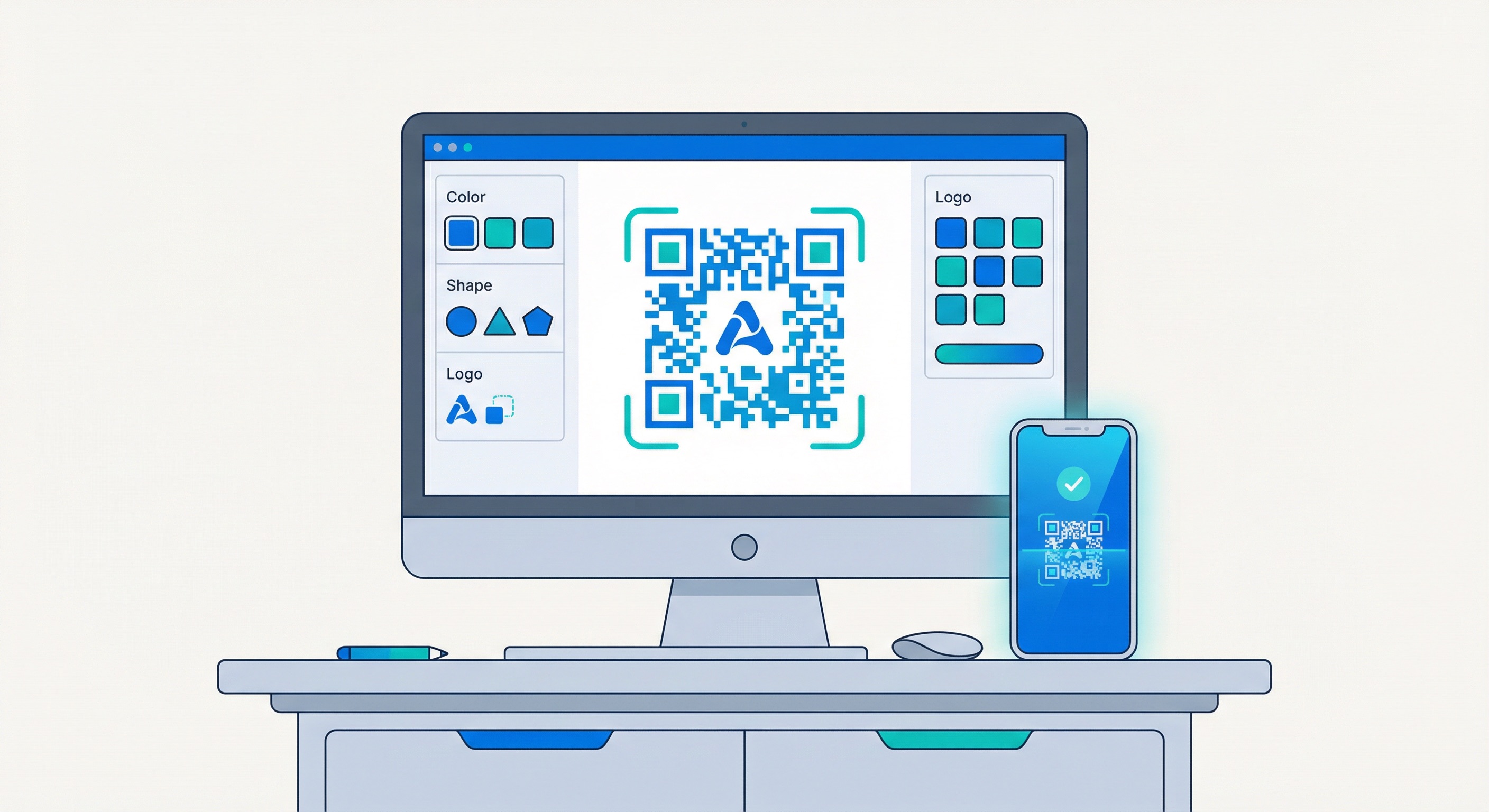
Supercode's QR code design tool gives you full control over every visual element without requiring design expertise. Here is the complete step-by-step process.
Log in to your Supercode dashboard and click "+ Create a new code." If you are starting fresh, the dashboard will be empty. If you have existing codes, they will be listed here with their scan analytics.
Select the type that matches your campaign objective. Common choices include:
Fill in the destination URL, contact details, or document link. For dynamic QR codes, this information can be updated after the code is printed — a major advantage for campaigns with evolving destinations. Double-check all content before proceeding; static code destinations cannot be changed after creation.
This is where your brand identity is applied. In Supercode's design editor:
Before downloading, scan the live preview on both an iOS device and an Android device. Test in normal lighting and then in lower-light conditions. Confirm the destination URL or content is correct.
For print materials, always download SVG — this vector format scales to any size without pixelation. For digital use (websites, email, social media), PNG at 1000px or higher is sufficient. JPEG is acceptable for digital but not recommended for print due to compression artifacts at edges.
Ready to get started? View Supercode's plans to find the scan volume that fits your campaign needs — every feature is included on every plan.
Once you have mastered the fundamentals, several advanced techniques can push your QR code design further — creating codes that are genuinely memorable and campaign-specific.
Instead of a flat foreground color, apply a linear or radial gradient that shifts across the code. The key constraint: the gradient must maintain sufficient contrast throughout its entire range. A gradient from dark blue to medium teal works; a gradient from dark blue to pale yellow risks failure at the lighter end. Always test a gradient code extensively before deploying at scale.
Beyond standard module shapes, some advanced design tools allow the data area to use patterns — subtle textures or stylized fills that give the code an almost illustrative quality. These work best in brand contexts where the QR code appears on branded merchandise or premium packaging where it needs to feel designed rather than functional.
Dynamic QR codes can be reprinted or republished with a different visual design while keeping the same destination — meaning you can create a holiday-themed version of a code without changing any underlying content. This is particularly powerful for retail campaigns where the same landing page drives different seasonal promotions. Learn how to structure these campaigns in our guide to QR code marketing ideas.
For organizations deploying QR codes across multiple channels and materials, consistency matters as much as individual design quality. Establish a brand system for your QR codes: a defined color palette, logo usage rules, CTA language style, and frame convention. This ensures that whether a code appears on a product label, a poster, or a social media post, it is immediately recognizable as belonging to your brand.
For teams deploying hundreds or thousands of codes, bulk QR code generation with Supercode allows a consistent design template to be applied across large code sets — see our bulk QR code guide for how this works at scale.
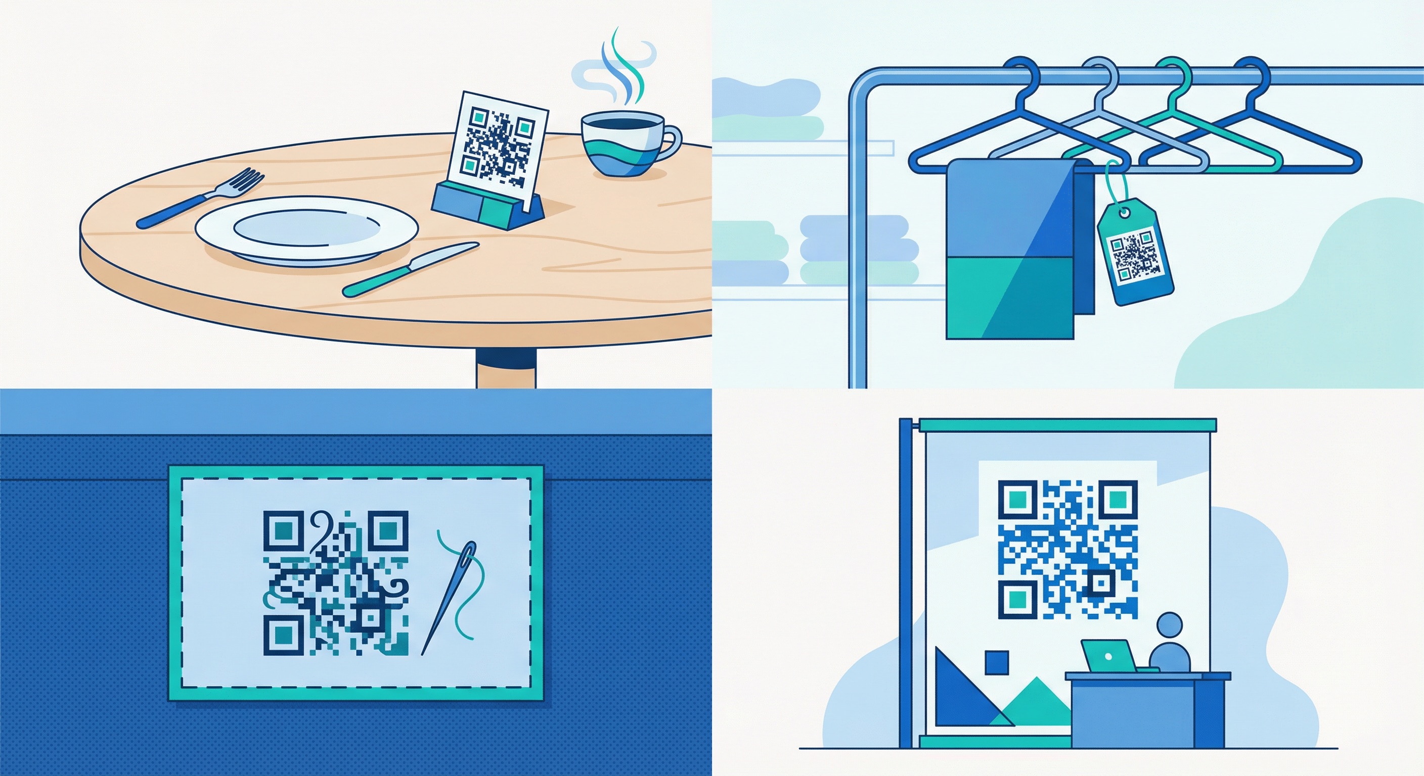
Optimal QR code design varies by industry because the scanning context, audience expectation, and physical placement differ significantly. Here is how to tailor your approach.
In dining environments, QR codes on table stands and menu surfaces are scanned in intimate, well-lit settings by users who have already made a decision to engage. Design for clarity: clean backgrounds, restaurant brand colors, and a simple frame CTA ("Tap to view our menu"). Avoid over-designing — a busy code competes with the menu content itself. For hotels and venues, QR codes in lobbies and guest rooms follow the same principle: elegant, brand-aligned, with a clear benefit statement. See our complete guide to QR codes for restaurants.
Retail QR codes compete for attention in visually busy environments — shelf edges, shop windows, and end-cap displays. Use bold, high-contrast designs and strong CTA frames ("Scan for price," "Scan for reviews," "Scan for 15% off"). In retail settings, the value proposition must be visible instantly, because the scanning decision is made in under two seconds.
In fashion and luxury contexts, the QR code must feel like part of the product — not a functional interruption. Minimal designs in premium colorways (gold on cream, black on white with a monogram logo) work best. Avoid frames with heavy graphic elements; a thin elegant border or no frame at all is more appropriate. The code itself should feel considered.
QR codes in event environments are often scanned quickly in crowded, variable-lighting conditions by people in motion. Prioritize maximum contrast and generous sizing. At trade show booths, a large-format code (minimum 10cm × 10cm on a banner) with a compelling CTA captures leads from attendees who do not stop to talk. On event tickets and lanyards, a smaller but high-contrast code with Level H error correction ensures reliable scanning even when materials are slightly crumpled or worn.
In healthcare and education settings, design should prioritize clarity and accessibility over creativity. High-contrast codes with institutional branding, a clear CTA (e.g., "Scan for patient information"), and generous sizing for users who may be at distance or have visual impairments. In these environments, a scan failure is not a minor inconvenience — design conservatively.
Even experienced designers make predictable errors when first working with QR codes. Understanding these pitfalls upfront saves reprinting costs and prevents campaign failures.
For a full audit of design and operational errors, read our complete guide to 10 mistakes to avoid when creating QR codes.
Creating a well-designed QR code is the first half of the work. The second half is measuring its performance and using that data to improve. QR code analytics research consistently shows that teams who actively measure scan performance outperform those who treat QR codes as set-and-forget assets.
Supercode's built-in analytics dashboard provides all of these metrics in real time. For a full breakdown of how to interpret and act on QR code analytics, see our QR code tracking and analytics guide.
Dynamic QR codes make A/B testing straightforward: create two versions of a code with different designs (different frame styles, CTA copy, or color treatments) and deploy them in equivalent locations. Compare scan rates over a defined period, then retire the underperforming variant. Even small design improvements compound over the lifetime of a print run.
If scan rates are lower than benchmarks (typical for well-placed codes: 15–25% of target audience), diagnose design factors first:
For data-driven QR campaigns at scale, scan behavior research shows that the combination of a branded code + clear CTA frame consistently outperforms generic codes by a wide margin. This design investment pays for itself after the first campaign measurement cycle.

The absolute minimum is 2cm × 2cm (0.8in × 0.8in) for a code scanned at close range (under 30cm). For standard print materials viewed at arm's length, 3cm × 3cm is more reliable. Use the formula scanning distance ÷ 10 = minimum size for materials viewed from further away. Full sizing recommendations by material are in our QR code printing guide.
Yes — in fact, you should. Use your darkest brand color for the foreground modules and your lightest brand color (or white) for the background. Verify the combination achieves a minimum 4.5:1 contrast ratio using a free contrast checker tool before finalizing. Pastel or mid-range tones in both foreground and background simultaneously are the most common color failure mode.
A maximum of 30% of the total code area with Level H error correction selected. For a 500px × 500px code, that is a logo no larger than approximately 274px × 274px. Starting at 20–25% coverage is safer and still visually impactful. Always test on multiple devices after placing the logo.
Yes, when designed correctly. A custom QR code with proper contrast, a correctly sized logo (if used), preserved quiet zone, and Level H error correction will scan as reliably as a plain code — while generating 30–45% more scans due to higher user engagement. The design variables that cause failures are all preventable with the practices in this guide.
SVG is the preferred format for all print applications. As a vector format, SVG scales to any size — billboard or business card — without any loss of quality. PNG at 1000px or higher is acceptable for mid-scale print. Avoid JPEG for print use; compression introduces artifacts at module edges that can cause scan failures at small sizes.
Dynamic QR codes for any print use. They allow you to update the destination URL after printing, track real-time scan analytics, and run A/B tests without reprinting materials. Static codes are appropriate only for data that will never change (a Wi-Fi password on an internal sign, a permanently fixed contact card). Full comparison in our dynamic vs. static QR codes guide.
The quiet zone is the blank white border surrounding a QR code, required to be at least 4 modules wide on all sides. It tells the scanning algorithm where the code ends and surrounding content begins. Removing or reducing the quiet zone — by placing design elements too close to the code edge — is one of the most common causes of scan failure in otherwise well-designed codes. Always preserve it.
Custom QR code design is not a cosmetic exercise — it is a measurable performance driver. Codes that carry your brand colors, logo, and a clear call-to-action generate more scans, build more trust, and integrate more naturally into professional creative work. The technical constraints are well-defined, the design tools are accessible, and the measurement framework is clear.
Supercode gives you everything you need to create professional, branded QR codes that function as durable marketing assets. From customizable colors, module shapes, and logo placement to real-time analytics and dynamic destination updates, the platform is built for teams that take QR code performance seriously.
Sign up free on Supercode and create your first custom-designed QR code in minutes. Explore all Supercode solutions to see how QR codes can be deployed across every industry and material in your marketing mix.